I'm thinking about going with a more abstract style than the textured/painted look I was originally planning. The graphics would be much easier to make - I could possibly even do all the artwork for an entire game by myself.
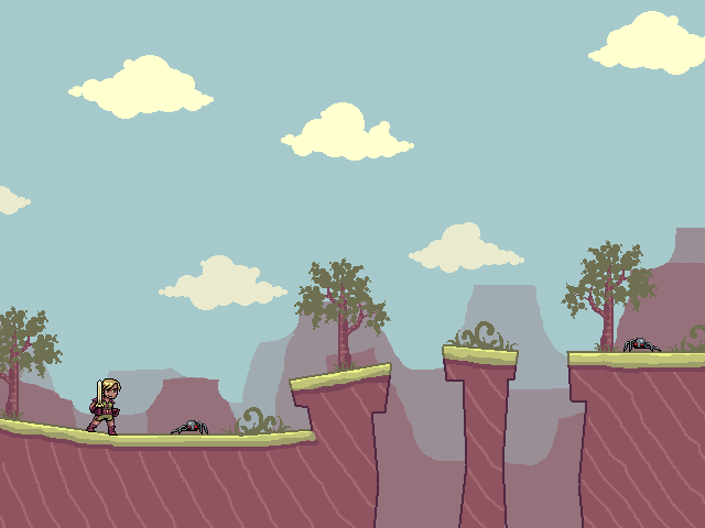
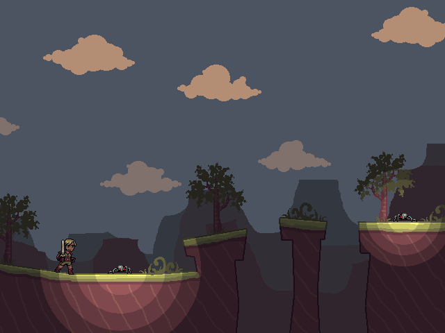
The sprites look to be a little too detailed for the environment. Flat colours might be more suitable there instead of the shading.


7 comments:
i'm glad you were smart enough to make it so that the foreground light doesn't cast on the background.
I like the style :D
I like the style, though for some odd reason the character style made me think of Ragnarok Online... No clear reason, it just does :)
so is there really no way for me to send users messages on this site? Am I just missing something?
Anyway, Anna, I wanted to invite you to a project. I know you have one of your own already, but I just thought it was worth a try. We have a very strong art team, and most of our team is working for game companies already. email me at mousse420@gmail.com or if you've got MSN add me, xylon420@hotmail.com. Even if you aren't feel free to add me as I like to talk game development
i like it!
and as niko said is a cool touch the one about the lights
Thanks for the comments!
Sovereign Games: I prefer not to make my email address available to the public. About your invitation, I'm not able to take on additional projects right now, unfortunately.
This looks cute. Very interesting.
Post a Comment